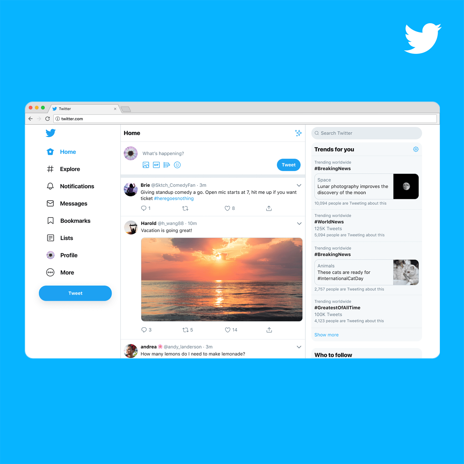
Today, we are starting to roll out a new Twitter.com – a refreshed and updated website that is faster, easier to navigate and more personalized. The site has an updated look and feel that is more consistent with the Twitter you see on other devices, making it easier to access some of your favorite features, and with more options to make it your own.
We’ve been testing aspects of this for a while so we could make sure the new site reflected how you use Twitter. Thanks to hundreds of thousands of responses we received during those tests, Twitter.com’s features make conversations easier to find and follow – and just a bit more fun:
- More of What’s Happening: We’ve brought over Explore to bring you the same great content found in our apps; expect more live video and local moments personalized for wherever you are in the world. Get context with profile information within conversations and check out your Top Trends in any view so you never miss what’s happening.
- Easy Access to Your Favorite Features: Bookmarks, Lists, and your Profile are right up front and have their own spot on the side navigation, making it easier and faster to jump between different tabs.
- Direct Messages All in One Place: Direct Messages have been expanded so you can see your conversations and send messages all from the same view. Now there’s less hassle switching between screens to send a message.
- Login, Logout Struggle No More: Whether you have one profile or a few, now you’re also able to switch between accounts faster, directly from the side navigation; your stan, foodie and cat meme accounts thank you.
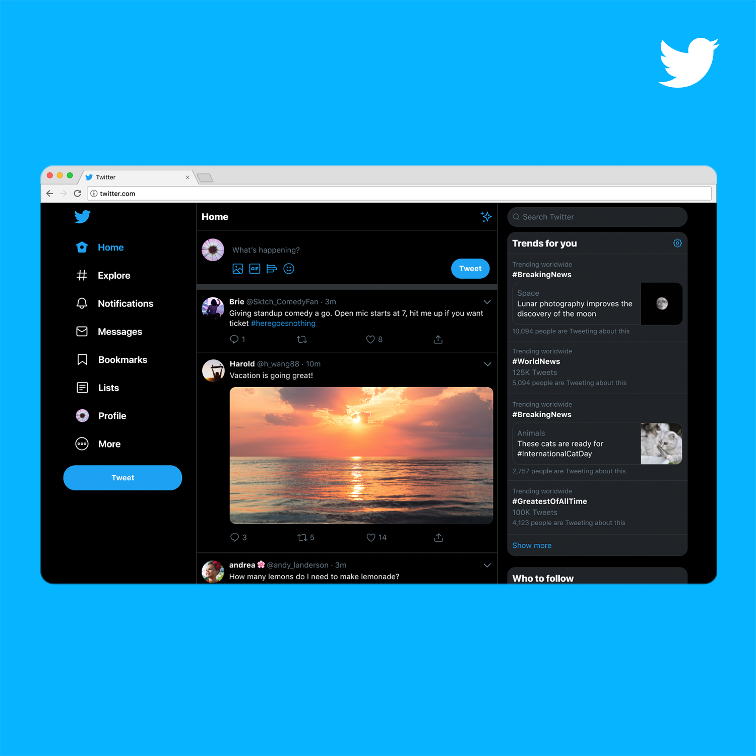
- Make Twitter Yours: The love is real for dark mode themes Dim and Lights Out. You’ve asked for even more ways to personalize Twitter so we’re bringing you different themes and color options, along with two options for dark mode.
Today is a big step as we continue building Twitter to best serve the people who use it every day. This update also gives us a much stronger foundation to build on so we can continue to bring you updated features faster than before.
Want to hear more from our team on how they redesigned and built Twitter.com? Check out our engineering blog series “New Nest: Building the New Twitter.com” which shares more on how we rebuilt the website from the ground up.
We’re looking forward to hearing what you think about our new site, so check it out and take it for a spin at Twitter.com.
[“source=blog.twitte”]

