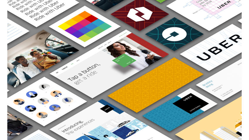
In case you’re wondering what’s wrong with the Uber Icon, we can tell you it’s not a glitch with your phone. Uber updated its logo and refreshed the look of its rider and partner apps and its website on Tuesday, introducing a design framework known as the ‘bit’.
“Have you ever looked at someone’s hairstyle and thought “oh my, you peaked in the 1990s?” Well that’s a bit how I feel about Uber’s look today,” wrote Travis Kalanick, CEO of Uber in a blog postannouncing the new look. The new look celebrates the company’s technology, and is customised for the cities it serves, he said.
“The old Uber was black and white, somewhat distant and cold. This belied what Uber actually is — a transportation network, woven into the fabric of cities and how they move,” He adds.
Uber’s website now shows customised colours and patterns, drawn from the team’s research of architecture, textiles, scenery, art, fashion, people, and more to come up with authentic identities for each of the 68 countries where it operates. The blog post illustrates different colours and patterns drawn from locales in China, India, Mexico. India’s colours are shown to adapted from the Gateway of India, with shades of green, blue, yellow, and ochre.
Uber has also introduced a new logo type, which cuts the curls in the font, to enhance readability. With a larger logistics play in mind, Kalanick writes that Uber moves more than just people, but foods and goods as well, and the new icons for the rider and driver apps are a result of their new design thinking.
[“source-gadgets.ndtv”]