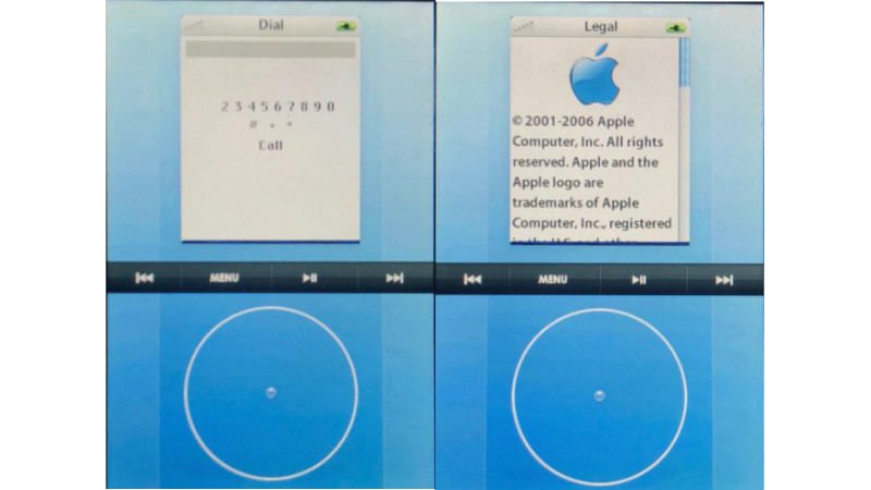
Until now little was known about the early prototypes of the first iPhone. Thanks to pictures published by Sonny Dickson, we now have a glimpse of one of the prototypes Apple discarded before its first iPhone went into production.
It’s no surprise that Apple considered a bunch of designs before finalising the iPhone, but the interesting thing is that Apple actually considered making an iPhone with a click-wheel interface. A similar interface was used on the iPod Classic and in hindsight we know that it wouldn’t have aged well.
The report claims that the prototype was designed around an operating system called “Acorn OS”, which was the internal code name for the software. Naturally it’s pretty different from iOS and the Sonny Dickson report claims that it showed a click wheel on the touchscreen. That means half of the screen is occupied by the click wheel while the rest showed apps and other settings. You can check this out in the video below.
On booting, the device shows an acorn icon. The interface does look rather odd if you look at how touchscreen devices have evolved since then. For one, the click wheel does appear to be a waste of screen space and it’s clear that Apple thought the same way. Had this device become a reality, one can imagine having a hard time trying to use the click wheel to select each character for an SMS or dialling numbers like retro landline phones with the rotating keypad.
The interface has options such as Contacts, Recents, Dial, Music, and SMS. Strangely enough the video doesn’t show a browser option in the UI. Perhaps it wasn’t ready at the time the prototype was designed.
Sonny Dickson writes that Apple’s 2006 patent application for such a device proves that the report is genuine and that very few units running Acorn OS likely exist today. The report points to the fact that Apple has people employed just to destroy prototypes.
[“source-ndtv”]