Raise your hand if in the past 30 days you’ve hunched over a plate, tweaking filters here, adjusting warmth or structure there, all to create the perfect #foodgram. If you consider yourself a pro, you probably also stand on your chair to achieve the ever-popular overhead shot. All the while, your food goes cold and the temperament of your fellow diners grows colder.
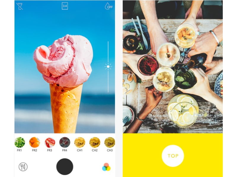
Foodie, a free iOS and Android app with filters it says are optimised for food photography, wants to make taking stylish photos of food simple. While other photography editing apps – most notably Instagram and VSCO – can filter your photos to almost no end, Foodie is relatively basic. You can open the app, choose the aspect ratio (3:4 or 1:1), and decide if you want blurred edges or to use the flash before selecting one of the 26 filters and shooting away. And important for you chair-standing, overhead-angle folk, when shooting in-app, a yellow bar flashes “top” to let you know when the camera is directly above your food. After snapping your shot, there is no further tinkering and no agonizing over the saturation or Lux levels; whether you like it or not, the filters do most of the work for you.
The filters did make my food photography pop – colours were brighter, angles sharpened here, edges blurred there – although I like to think that some pre-photo staging and styling remain important.
My biggest test came when taking photos in dimly lit areas, when the poor lighting almost always produces terrible images of food (see Martha Stewart’s famously awful Twitter photos circa 2013). With Foodie, even my tater tots and empty cocktail glass shot in a dark bar looked good.
My only quibble lies in terminology. Putting aside the mildly eye-roll-inducing name of the app, the names of Foodie’s filters are a touch redundant with five shades of “yum” (varying levels of saturation), four shades of “fresh” (more varying saturation levels meant to be used with fruit and vegetables), two shades of “crispy” (sharpens images, varying saturation) and so on. Perhaps instead of four shades of “sweet” or five types of “romantic,” the developers could name one filter “cakes” or another “candlelight.” Maybe instead of several barbecue filters, they could try “Texas” (which would make everything look dry, in Texas dry rub style) or “Carolina” (adding a golden hue in homage to Carolina gold barbecue sauces). But then again, what’s in a name when my food looks so sweet?
If only someone would make an app to come up with clever captions or find the perfect emoji, we could get on with our meals that much sooner.
[“source-ndtv”]
