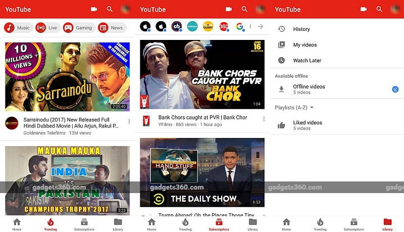
After testing it for around one year, Google has finally made YouTube for Android’s redesigned layout official. Notably, the new design repositions the navigation bar, earlier placed at the top of the screen, to the bottom half just like on the iOS counterpart of the app. The redesign is claimed to allow for easier navigation within the app.
With the YouTube for Android update, the size of the top navigation bar is reduced substantially. Interestingly, the upload button, which was earlier a floating button, has now been shifted to the top bar. Apart from upload, other options in the top bar include the ones for casting videos and for searching them on the platform. The update notably brings separate sections for Account and Library.
While users will be able to find their likes, uploads, favourites, and playlists in Library, they will have to tap on the YouTube user icon to get access to account and app settings, as pointed out in a report by Android Police. “The app remembers where you left off on each tab. For example, if you scroll down through the Home feed, then go to your Subscriptions tab, and then return to Home, you can easily pick up where you left off,” a community manager explained in her post on help forum.
The new design is said to be “slowly rolling out” to Android, and we spotted it on at least one of our devices. Let us know in comments down below if you are able to see the new YouTube design on your Android device.
For the latest tech news and reviews, follow Gadgets 360 on Twitter, Facebook, and subscribe to our YouTube channel.
